- Home
- Blog
3 Second Rule of Designing a Trade Show Display
Posted by Emily Veres | Topics: Displays, Graphic Design, Trade Show | on Oct 16, 2017 10:00:00 AM

No, this blog isn't referring to your toddler dropping their food onto the ground and proceeding to eat it (although we've all done that), it relates to your trade show graphics and the audience. Your trade show booth space and more importantly, your trade show booth design, must attract the audience in 3 seconds - or you could lose a potential prospect.
I have been to countless trade shows where my eyes simply skip over trade show displays because they just don’t catch my attention, even if they were giving away samples, I may not have noticed because in that 3 seconds I wasn't enticed. It’s just the way our minds work.
Scientifically, we skim through items we are initially looking at and determine whether we are interested or not. Imagine you're walking downtown and see a store window display. Is this enticing enough to bring you in to the store and look around, or do you simply walk past and on to the next one?
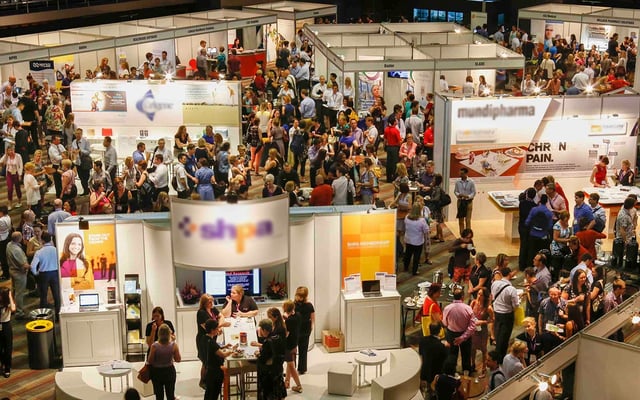
When you are competing at a show for potential prospects with hundreds of other companies, you want to stand out. How you ask? Your design needs to convey your brand quickly and effectively, all while pulling in the audience’s attention in 3 seconds, such that of a window display.
Less is more
I cannot stress this enough. A clean, simple, and easy to understand design will trick the eye and allow your display to appear to be a larger exhibit than it is. A booth design with lots of text, graphics, and colours can feel crowded and appear smaller. You simply end up lost among the crowd.
So how do we fix this?
I understand that trade show displays are not cheap and you want to get as much "Bang for Your Buck". Fitting as much information as you can on to your display can sometimes work against you. When designing your trade show display, I recommend utilizing white space to simplify the overall look. This gives our eyes and mind a chance to breath and process what it is we are seeing.
White space in design, is not actually white-space, but is so effective if used properly. In trade show design: textures, shapes, images and graphic accents can overwhelm the overall purpose of the booth. Less is more.
Another tip to keep your display simple and easy to understand, is the amount of text used. I often tell our clients that we want the prospects to have a personal conversation with you. This contact is much more memorable than being able to read a display and walk away without human contact.
In 3 seconds, we don't want the audience to feel overwhelmed. We want to bring them in and chat to find out more. If you are able to get prospects in to your booth and converse, you are one step ahead of the competitors.

Image courtesy of commons.wikimedia.org
There are a couple of easy steps to apply if your trade show display is in the design process right now:
A crisp logo
- Your logo will look its best and reflect your company if it has crisp, clean lines (vector format). If you win a prospect to chat with you in your booth, a fuzzy logo (small raster format) is going to be noticed and may be the selling point for how long they stay. Vectorized logos will always be your best bet!
Add colours but not the rainbow
- You want the colours on your display to be there intentionally. If the colours you see in the design do not reflect your company, maybe it's best to leave those out. If your company brand consists of 5 or more colours, we can incorporate them in creative ways. Funky footers, design accents, or borders may all work!
Eye catching images
- Your images or graphics should highlight your company and not create confusion. If you have multiple images, sometimes it's best to only choose a select few which really reflect what you're trying to communicate. Stock photos work great but make sure these support the company and not take away from it.
There are lots of factors which can effect why individuals will come into a booth space, but the first thing they should see is a clean, easy to understand design that clearly articulates who the company is and what they do immediately.
It takes 3 seconds for someone to decide if your booth is approachable or not. If you're not sure or have run in to any of these issues, contact us and we can help!
Save Money - Check out our guide on How To Save Money In Your Trade Show Budget!
Recent Blog Posts
Subscribe to the blog
Introduce Your Blog
Who's writing it? Why are they writing it? Why should potential readers pay attention to the people writing it? Introduce it in a few sentences, and maybe add a picture of the primary authors.
Posts by Topic
- Knowledge Base (41)
- Trade Show Strategy (26)
- Displays (16)
- Trade Shows (15)
- Insider (14)
- Trade Show (12)
- Graphic Design (10)
- Trade Show Budgets (10)
- Custom Displays (5)
- Graphics (5)
- Covid-19 (4)
- Experiential Activation (4)
- Portable (4)
- Events (3)
- Experiential Marketing (3)
- Fabrication (3)
- Office News (3)
- Portable Displays (3)
- Print and Production (3)
- A/V (2)
- Modular Displays (2)
- Technology (2)
- Trending (2)
- Branded Environments (1)
- Discounts (1)
- Experiential (1)
- Holidays (1)
- Installation (1)
- Pop-up (1)


