
 Our most satisfying moments are when we complete a project and find that a positive experience was shared by both ourselves and the client. This is one of our outcome goals - that moving through our processes with confidence and commitment will lead to an ideal experience for the client.
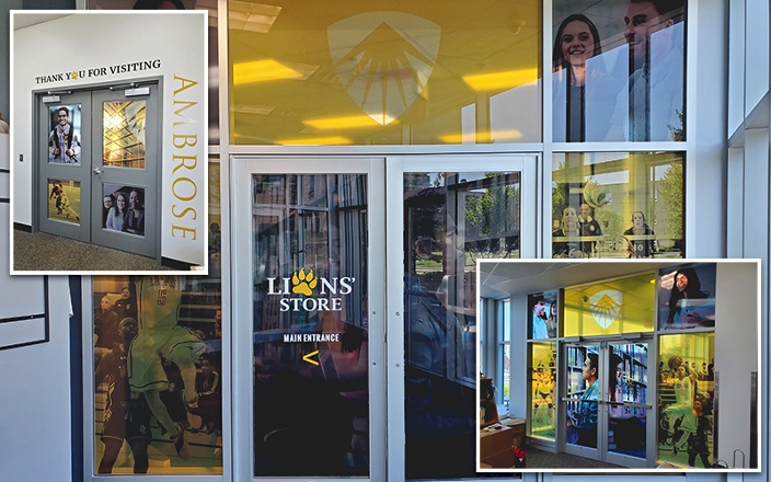
Recently we worked with Design Asylum and the Lions' Bookstore at Ambrose University. We asked the client for a review and simultaneously wrote about our perspective. The result? Two perfectly aligned presentations of the process. Something that we think we can be proud of!
In John's Words:
"Previously known as the Ambrose Bookstore, the newly named Lions' Store offers a streamlined, one-stop shopping location where students, faculty and staff can purchase merchandise, clothing as well as textbooks and recently published faculty works.
Design Asylum was asked to give the Lions Store a refresh and rebrand far beyond a new logo and a fresh coat of paint.
Using Ambrose University branded black and gold colours, window panels were designed using a diverse group of current students, including those in class or at study, in the library and on the basketball court and soccer pitch.
The new look Lions' Store has been well received by the Ambrose community and stands out amongst the schools lecture halls, offices and meeting rooms.
Tyler at Exhibit Studio ensured the project went off without a hitch. His intention to detail included precise measurements, thorough colour testing balance and installation.
Many thanks to the professional, creative and knowledgeable staff at Exhibit Studio, for making the Lions' Store relaunch a big success." - John Pollock Design Asylum
In Exhibit Studio's Words:
Our team conducted a first site visit to acquire accurate measurements of the windows for design templates and to drop off a few print samples so that the University team could choose what materials they wished to use. This was an essential step because different materials offer different privacy and finish levels. You can use materials to provide complete privacy by allowing you to see out of a room but preventing others from looking in. Other options include frosted or translucent finishes to allow varying levels of two-way views.
Once they made their choice, there was extra-special care that went into printing their colours to perfection. Our print technician, Tyler, put his 20-plus years of print experience to work and adjusted the colours to match the Pantones provided, and we saturated the graphic with ink to make it vibrant. Doing this also increased the contrast between the images, the entire yellow panel, and the logo. We visited the University a second time to provide them with test prints of their approved designs with different levels of colour saturation so their team could choose and visualize the finished look.
The week before the school opened for the new fall term, we finished the graphics and prepped them for installation. Onsite, the wow factor had settled in before everything was fully positioned. Even as the graphics were going up, people made favourable comments and were extremely thrilled about how these colourful graphics injected liveliness and spirit to the formally simple space. Without a doubt, the final appearance is vibrant, lively, and captivating.


