Getting Started with Wayfinding: An Introduction to Signage Design

introduction
The history of wayfinding goes back to the beginning of civilization. For thousands of years, people have used symbols to identify and locate places like taverns and trading posts. Today, wayfinding is more elaborate, but its purpose is the same: to guide people where they need to go.
This guide outlines the key steps in the wayfinding planning process to help get you started.
Signage vs. Wayfinding: What's the Difference?
Signage
- Communicates one message: information, a rule, a warning, or a promotion.
- Can be understood on its own and doesn't rely on other signage to make sense.
- Can be longer or more detailed: hours of operation, policies, safety instructions.
Wayfinding
- Helps people navigate, answering questions like "where am I, where do I go, am I on the right path"?
- A collection of signs and cues that work together to guide users through a space.
- Typically brief and scannable (labels, arrows, icons, simple wording).
Think of it this way: a sign telling you the coffee shop is open until 9 pm is signage. A sign with an arrow pointing you toward the coffee shop on the second floor is wayfinding.
The Purpose of Wayfinding
Wayfinding helps people navigate spaces by clearly labelling rooms and floors, and providing mapped directions throughout a wide range of environments. Anywhere people move through a space they're not already familiar with is a candidate for wayfinding:
- Offices and corporate campuses
- Retail businesses and shopping centres
- Warehouses and industrial facilities
- Educational facilities — schools, colleges, and universities
- Residential communities and multi-family housing
- Hotels and resorts
- Hospitals, medical clinics, and healthcare facilities
- Airports and transit terminals
- Train lines and public transportation networks
- Parks and trails
- Museums and galleries
- Recreation and convention centres
When to Incorporate Wayfinding
- During the construction and planning stages of a new build
- Upon acquisition or addition of a new space
- During a rebrand, renovation, or spatial reorganization
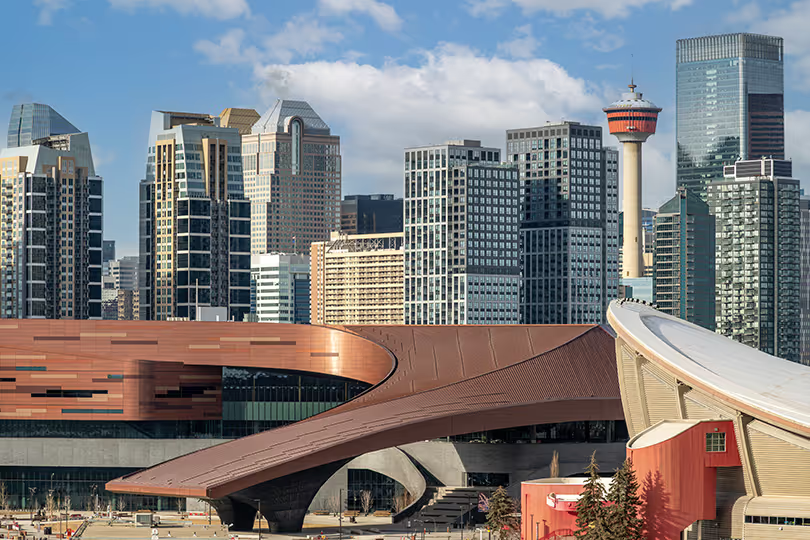
In general, wayfinding signage is most valuable in large or complex spaces where navigation is not immediately intuitive. It plays an important role in the overall user experience for visitors, staff, or volunteers.

Tips for Planning a Wayfinding System
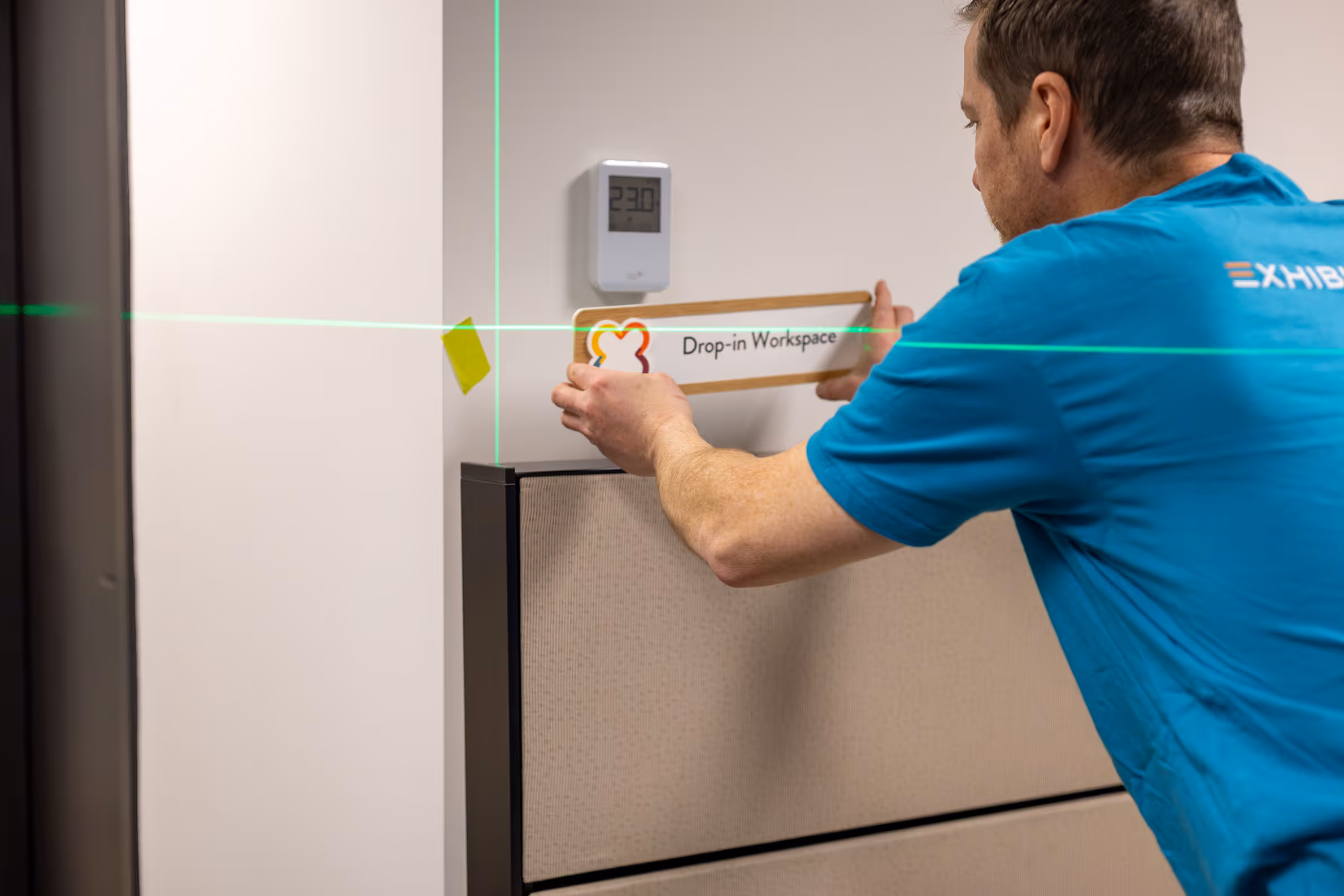
- Identify where each wayfinding sign will go. Outside doors, at entrances, at elevators, at decision points — wherever someone might stop and wonder which way to go. This will determine the number of signs needed and help with budgeting.
- Visualize sign placement. Photograph the space and create a rough sketch/plans of potential sign locations.
- Take measurements of the space to determine appropriate sizing for the wayfinding signage.
- Develop the signage content, including: room and floor numbers, building and space names, directional arrows, and symbols for amenities such as food services and washrooms. Plan other elements like colour, typography, and graphic style.
- Test the wayfinding plan with people unfamiliar with the space. Have them follow the signage plan, then identify any areas where navigation may be unclear or confusing.
Careful planning helps prevent oversights — missed spaces, dead-end directions, or conflicting cues — and reduces the need for extensive revisions later on.

Design & Material Considerations for Wayfinding
Readability, Visibility, Accessibility
Wayfinding only works if it can be read and understood quickly (often at a glance, while moving). Design choices that might look elegant in a layout can fail in a real-world environment if they compromise legibility.
- Consider letter size, colour contrast between text and background, and whether the signage is visible from a distance. High contrast — light text on a dark background, or vice versa — dramatically improves legibility, especially for users with visual impairments.
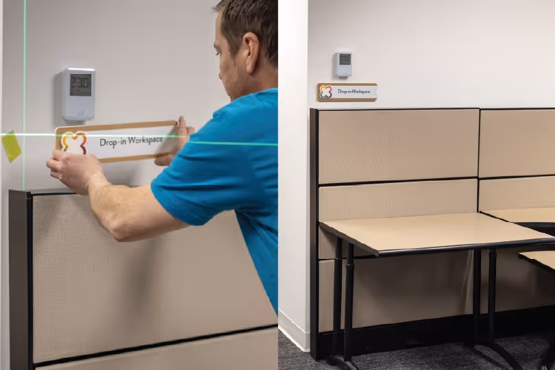
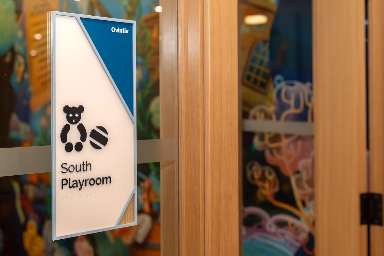
- Incorporate braille and tactile elements on signs in accessible locations, particularly room identification signs adjacent to doors. Check accessibility codes in your jurisdiction.
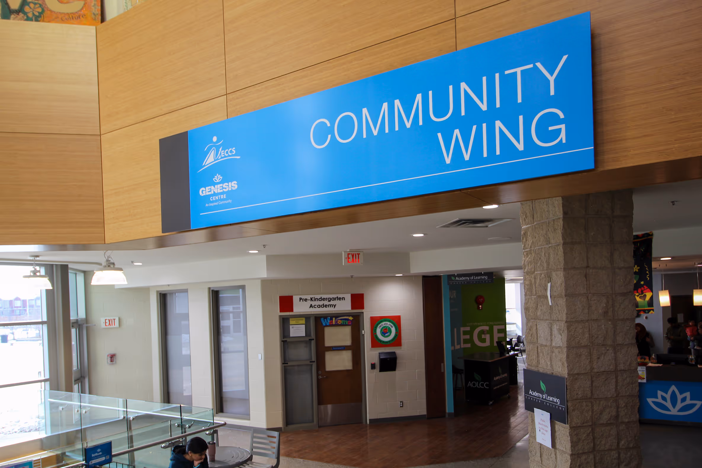
- Create a clear text hierarchy that makes information easy to process at a glance. The most important detail (the destination name or directional arrow), should be the first thing you notice.
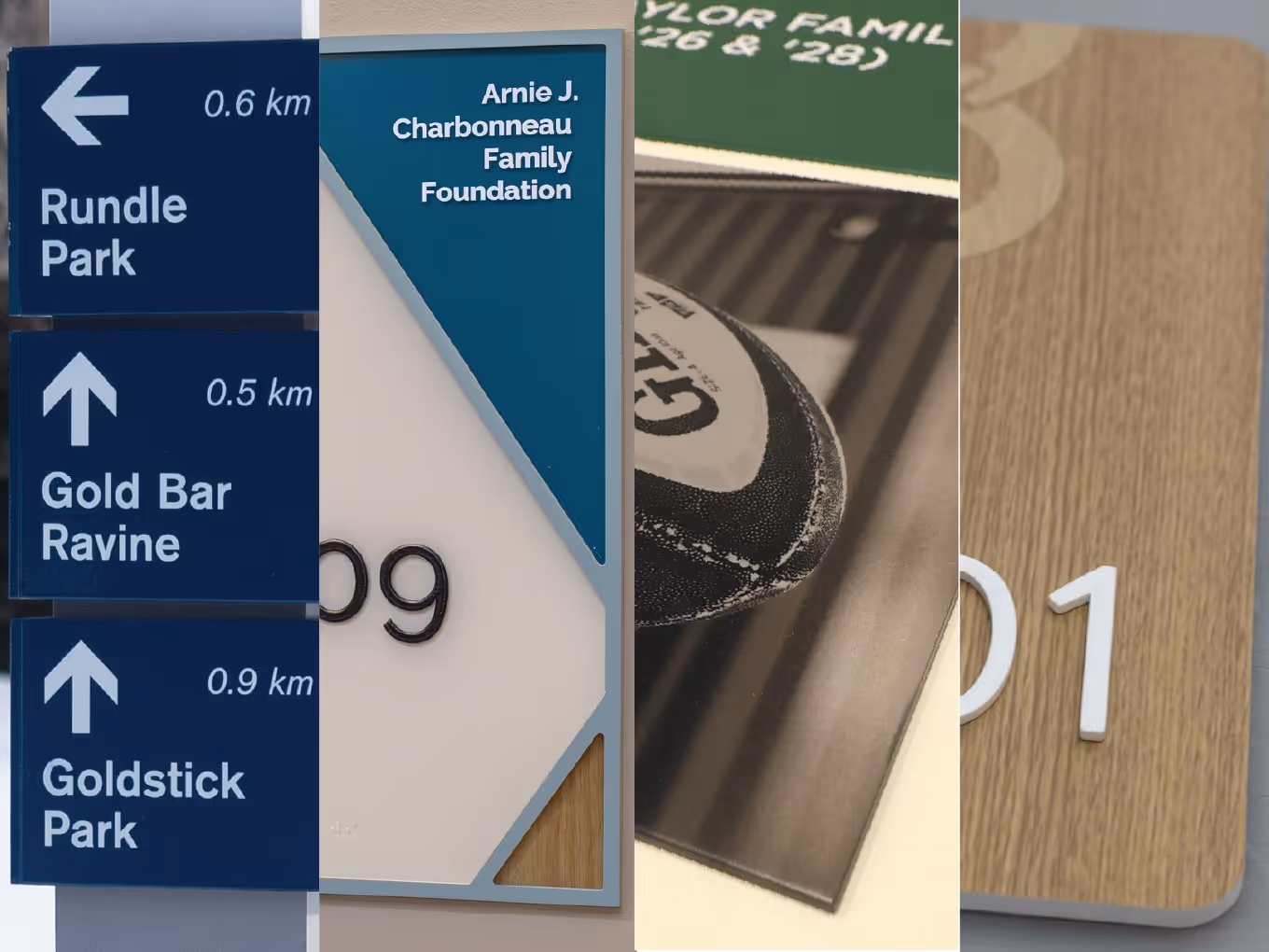
- Use universal symbols such as arrows, washroom icons, and food service indicators for instant recognition and to help overcome language barriers.
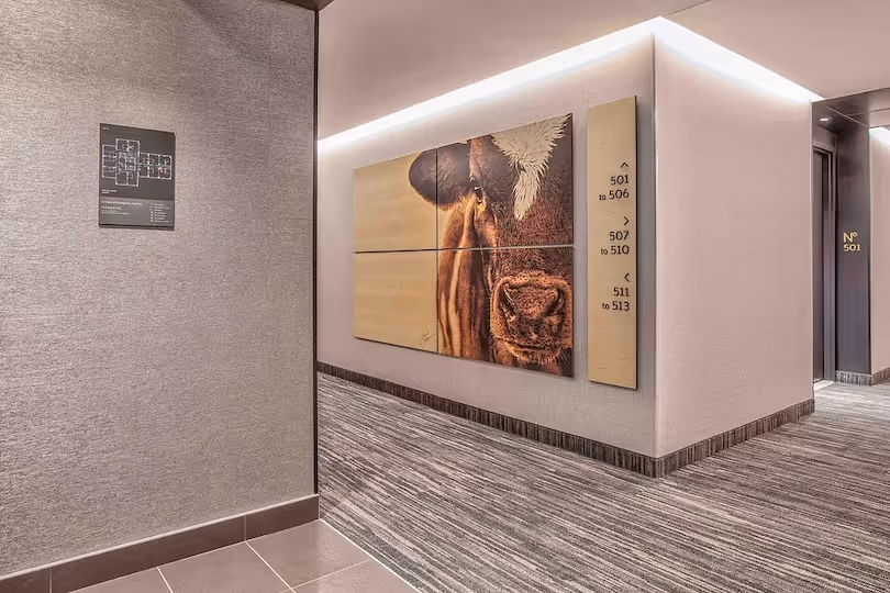
- Place wayfinding signage at a height that is visible and accessible to all users, including those using wheelchairs or mobility aids. A consistent mounting height across a system also makes signs easier to locate instinctively.

Consistency
- Ensure the wayfinding system feels cohesive. Not every element needs to look identical, but they should work together visually and be recognizable as part of a unified system.
- Use branding to enhance visibility and reinforce recognition. Colour, typography, and graphic style are all tools that connect wayfinding to the identity of the space and organization.
- When designing, consider whether additional signage may be needed in the future for new rooms, floors, or expanded areas. Consider how new sign additions can remain consistent with the existing system.
- Keep wayfinding signage in a standardized location. For example, at eye level to the left of every door on each floor, so that visitors learn where to look. Predictability is an asset.
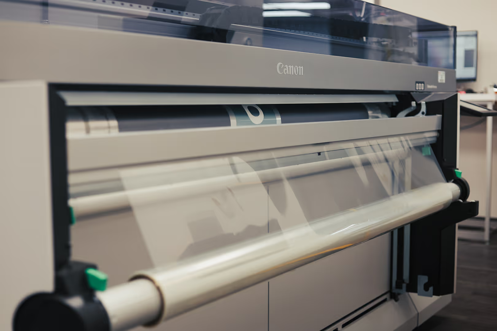
Material Considerations
Choosing the right material goes beyond looking good. It affects signage longevity, maintenance, and cost. Where your signage lives and how much handling it gets should inform every material choice.
Outdoors
Exterior signage faces constant exposure with UV rays, moisture, temperature swings, and wind. The materials used need to be able to withstand the elements without fading, warping, or corroding over time.
- ACM panels
- Brushed aluminum, stainless steel, or brass
- Powder-coated aluminum panels with dye-sublimated graphics
Indoors
Interior signs can deal with a different kind of wear in high-touch areas, with frequent cleaning, and the occasional bump or scuff. The right material here balances durability with appearance, especially in polished or public-facing environments.
- ACM panels
- Laminated wood
- Acrylic
- PVC
- Glass and frosted vinyl
Temporary
Temporary signage needs to be practical above all. Easy to move, reposition, or remove without leaving a trace, and flexible without sacrificing legibility.
- Removable adhesive vinyl
- Fabric
- PVC
- Foam board
- Bannerstands
- A-frame and sandwich boards
- Magnetic and modular systems
Dimensional elements: raised lettering, cut-out symbols, varying textures, and shaped panels — are layered on top of whatever base material you choose. They make a significant difference in how premium or refined the finished product looks.
final thoughts
Wayfinding has a long history and continues to play an important role in how people move through spaces. Today, it is often seen as an extension of a brand's identity, and is one of the most visible elements in any built environment. The materials you choose, the way signs are mounted, and the consistency of the system all communicate something about the organization behind them.
But while branding can deepen a wayfinding system's visual impact, function and accessibility should always come first. A beautifully fabricated sign that people can't read, find, or understand has failed at its most basic job. The best wayfinding is clear, confident, and effortless: it moves people where they need to go without asking them to think too hard about it.
Sign up for more insights like this!
Let’s talk ideas